Stryda Design System
At Stryda, we built a Design System to unite our teams and make work easier for everyone. It's like our secret language that helped during our brand change in 2023!
TEAM: 3 product designers • 2 graphic designers • 1 developer • 2023
Introduction:
- We began by exploring colors and typography, conducting research and experimenting with various options until we identified the best fit for our needs.
- The decision on colors and typography was a collaborative effort involving both Product and Creative designers. We discussed and determined what would work best for our product.
- Dimitar Tutkovski and I collaborated on creating, updating, and maintaining components in the design system, with Max Adolfsson contributing to the initial version under the company’s previous brand, G-Loot.
- As time progressed, we encountered real-life situations where adjustments were needed to adapt to new challenges, particularly when the Stryda branding initiative emerged.
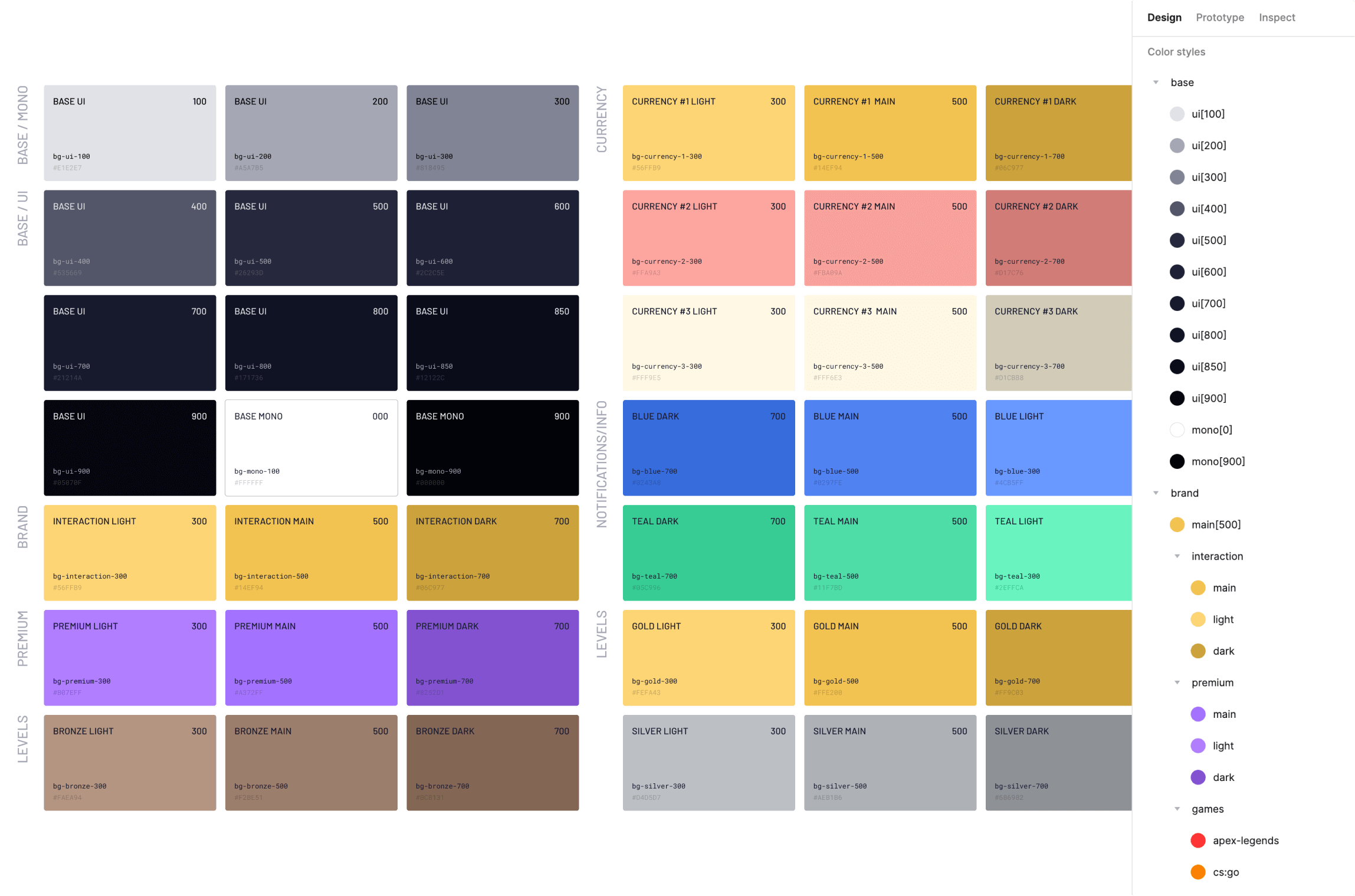
- To streamline our design system, we organized colors into different categories based on their purpose. These categories include:
- Base colors: consisting of 12 shades from light to stryda.
- Brand colors
- Premium colors
- Interaction colors
- Decorative colors
- Currency colors
- Info colors
- System colors
- Game-specific colors
- The colors we selected align with the names and properties used in the developers' Framework. This ensures consistency between our design files and development processes.
- Throughout this journey, designers gained insights into how the developers' Framework operates and received training sessions on CSS.
Typography:
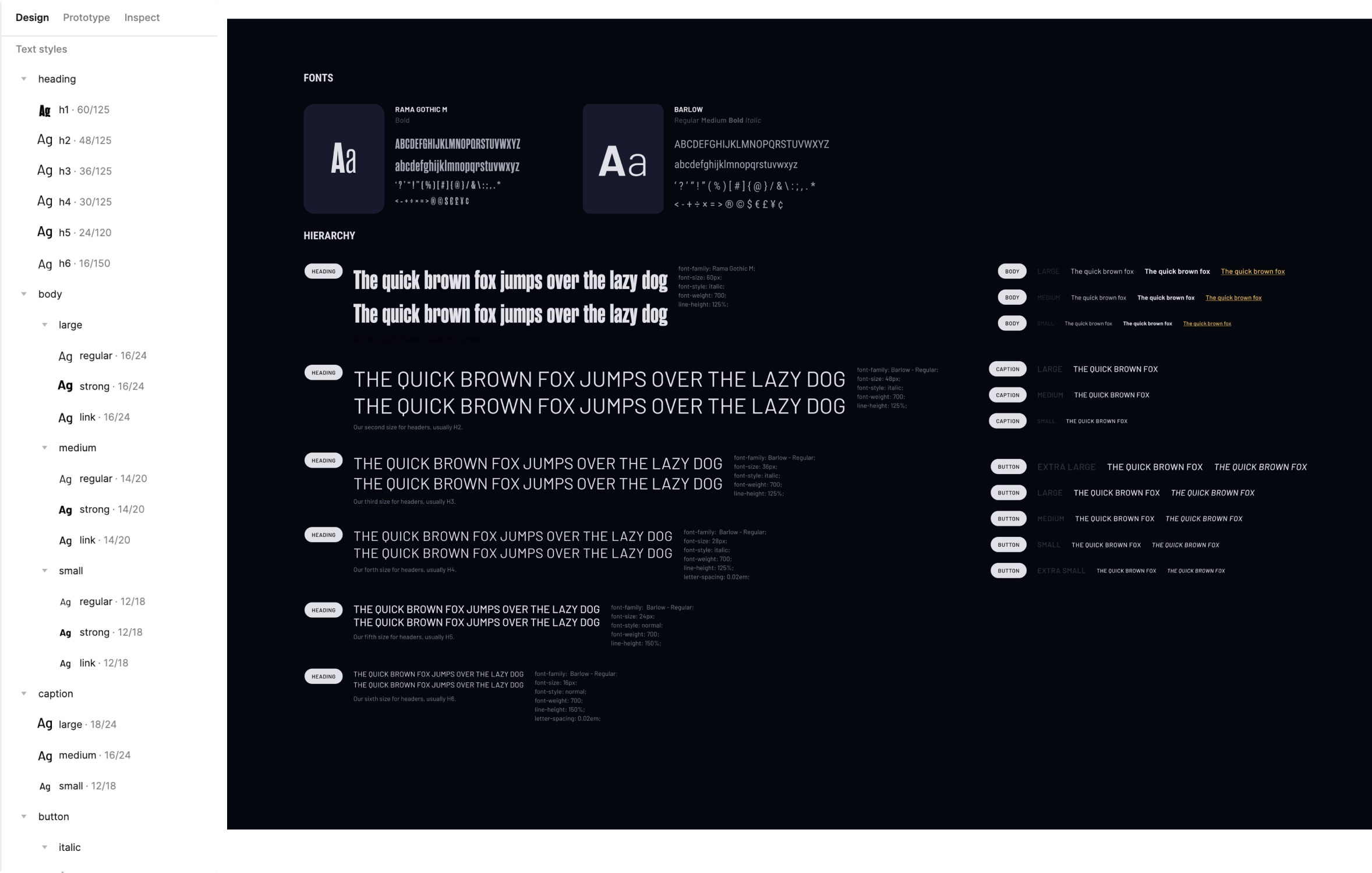
- For typography, we opted for two options:
- Our primary font is RAMA GOTHIC M, which lends the platform, branding, and marketing materials a distinctive gaming personality.
- For blocks of text and accessibility, we utilize Barlow.
- While Rama Gothic is visually appealing, it can be challenging to read in smaller sizes. To address this, we chose two fonts that complement each other well and create a harmonious visual experience.
Atoms & Molecules:
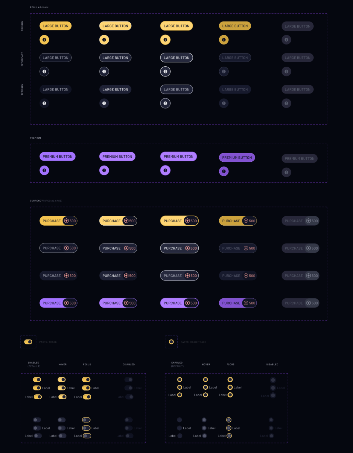
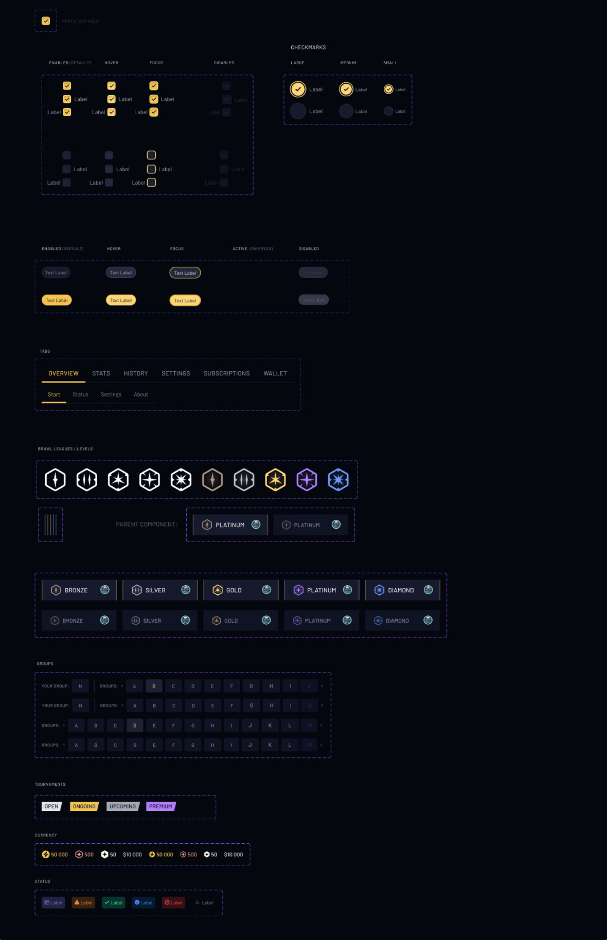
- Our Design System follows the Atom-Molecule-Organism approach for organizing our content. We found this approach to be the most suitable for categorizing and creating our components effectively.
- After finalizing our decisions on colors and typography, we proceeded with defining our Atoms, which include:
- Buttons
- Chips
- Toggles
- Checkmarks
- Pagination
- Tabs
- Progress bars
- Loaders
- Avatars
- Additionally, we identified Molecules, which encompass:
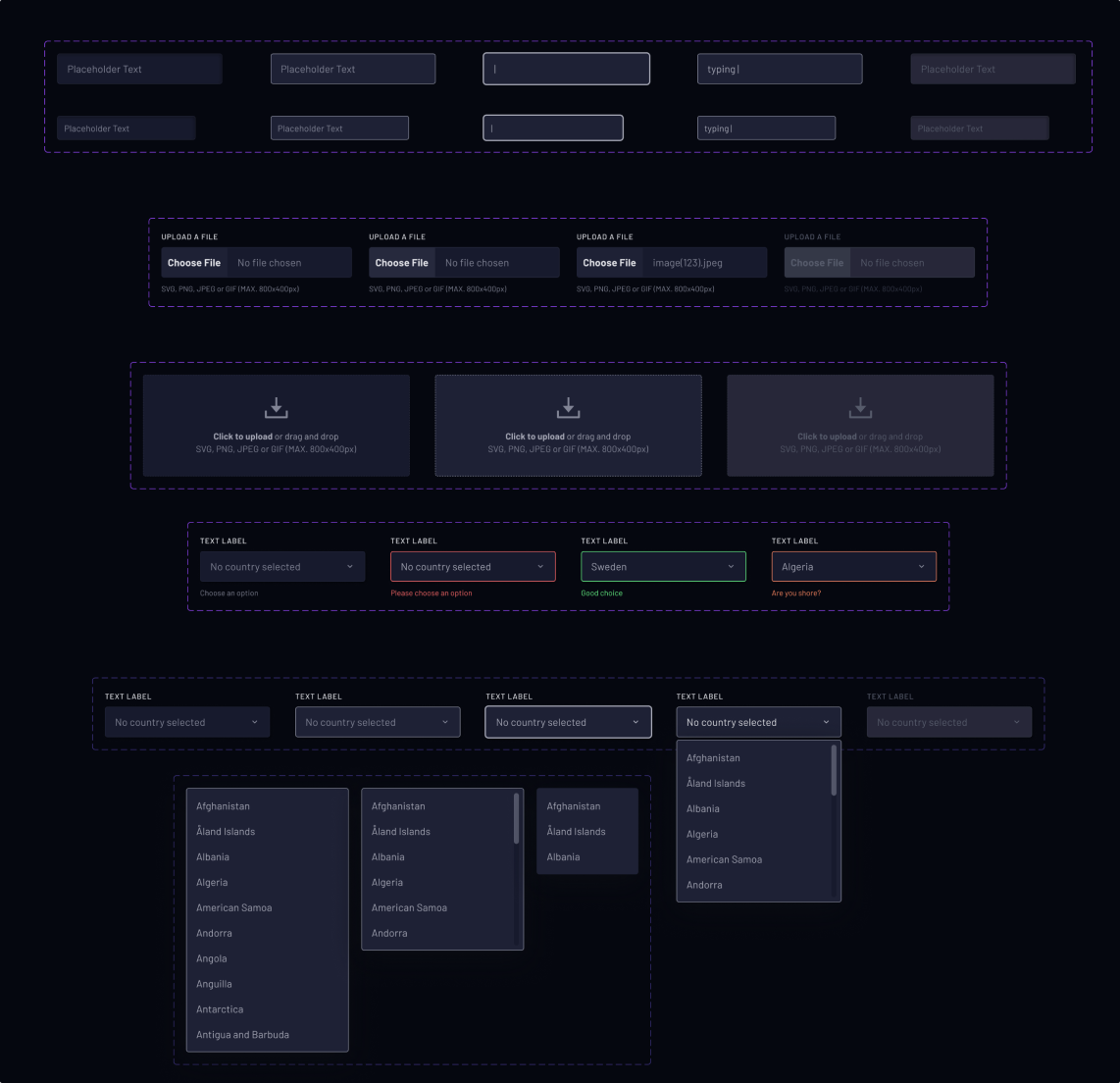
- Inputs
- Mission and tournament cards
- Notifications
- Countdowns
- Modals
- Avatars
- This structured approach helps us systematically develop and maintain our design components.
Organisms:
- In the organisms files of our Design System, we store various components such as:
- After finalizing our decisions on colors and typography, we proceeded with defining our Atoms, which include:
- Left navigation
- Top bar
- Notifications modal
- Accordions
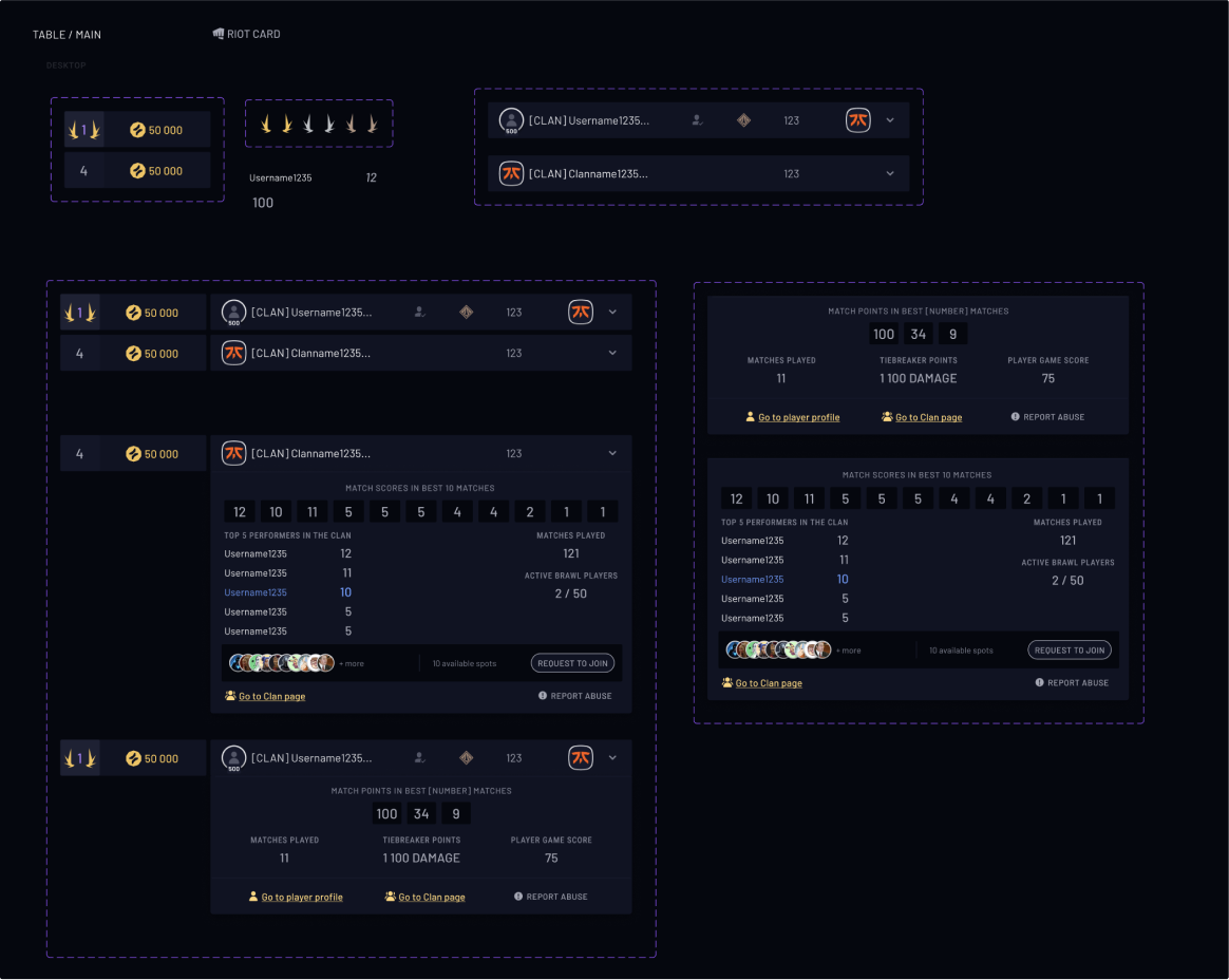
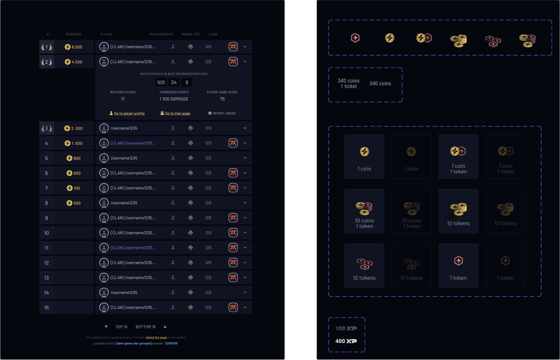
- Tables
- Footers
- Battle pass components
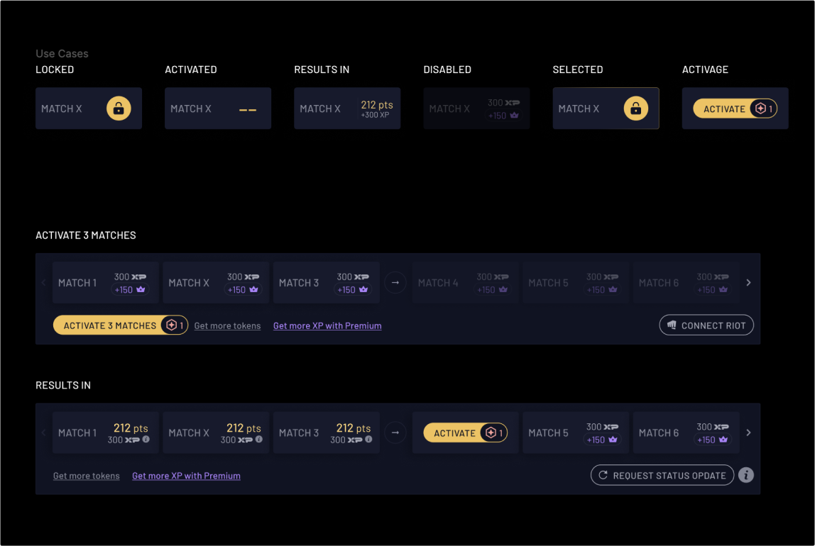
- Match cards with different states
- These components form the core building blocks of our design system, allowing for consistent and efficient development of our products.
