Stryda Premium
Our Premium page has been a bit neglected in recent years as we've prioritized other parts of the platform. But now, it's finally time for some upgrades, and Premium is ready to shine!
TEAM: 3 designers • 1 product owner • 2 developers • 2023
Contribution:
- Revise the layout and information presentation on the Premium page to facilitate easy comparison between Freemium and Premium.
- Restructure the page layout to prioritize essential content and streamline the tagline for better clarity.
- Simplify the presentation of Premium benefits to enhance the user experience.
- Increase Premium subscriptions by emphasizing a compelling selling point through impactful graphics and persuasive copy.
- Reduce friction and maintain user engagement by refining the page content.
- Redesign the page post-subscription to encourage continued Premium membership.
- Provide clear information about the user's current subscription status.
- Enhance the visual hierarchy of subscription cards for improved clarity.
Improvements:
- Before the redesign:
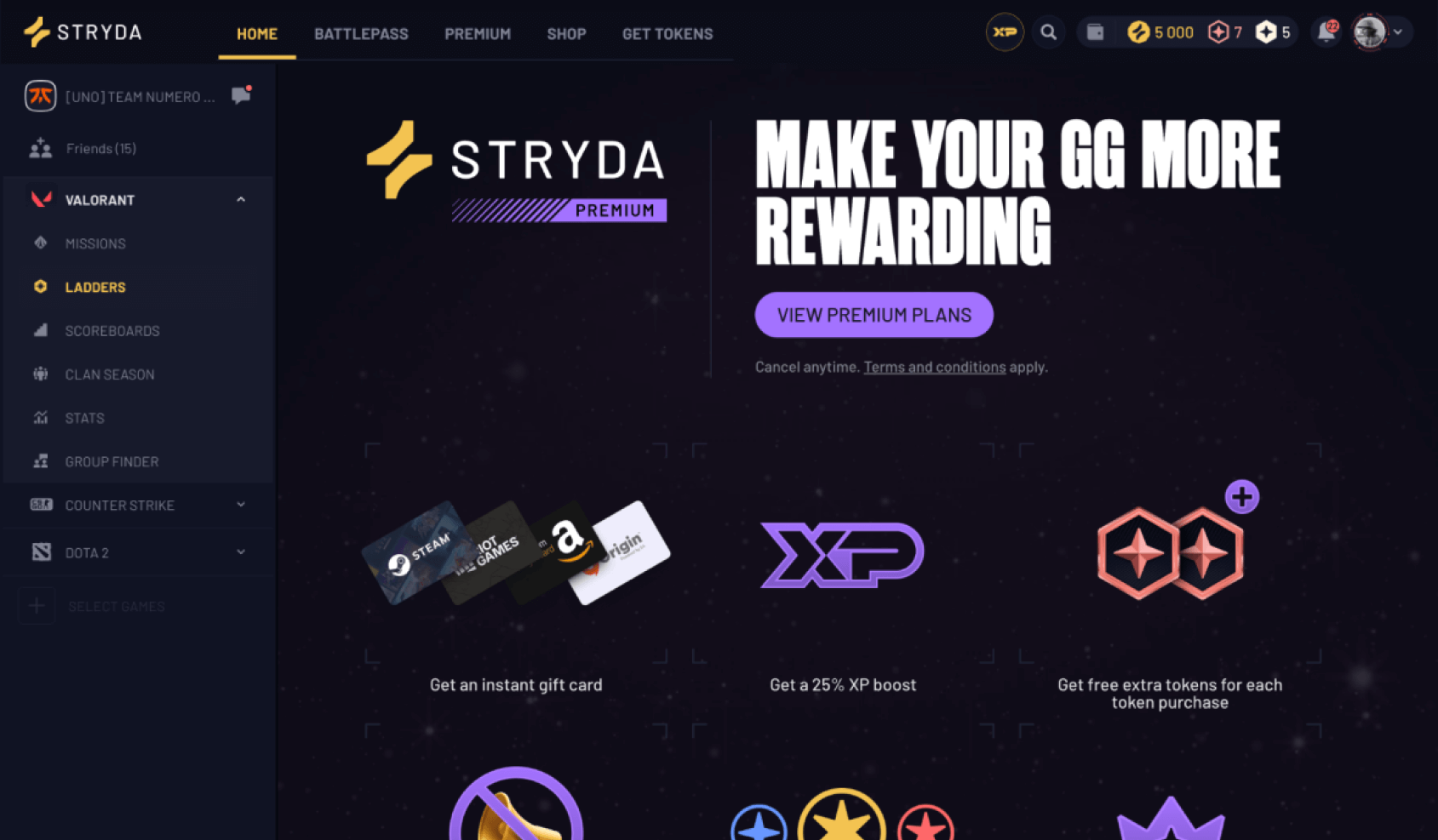
- All content was on a single, lengthy scrollable page, leading to user friction and a lack of clarity (fig1).
- Upon visiting the page, users encountered only the tagline, occupying a third of the screen space, along with the initial line of graphics and benefits (fig1).
- To access additional information, users had to scroll, causing inconvenience, especially as the list of benefits increased in length.
- After the redesign:
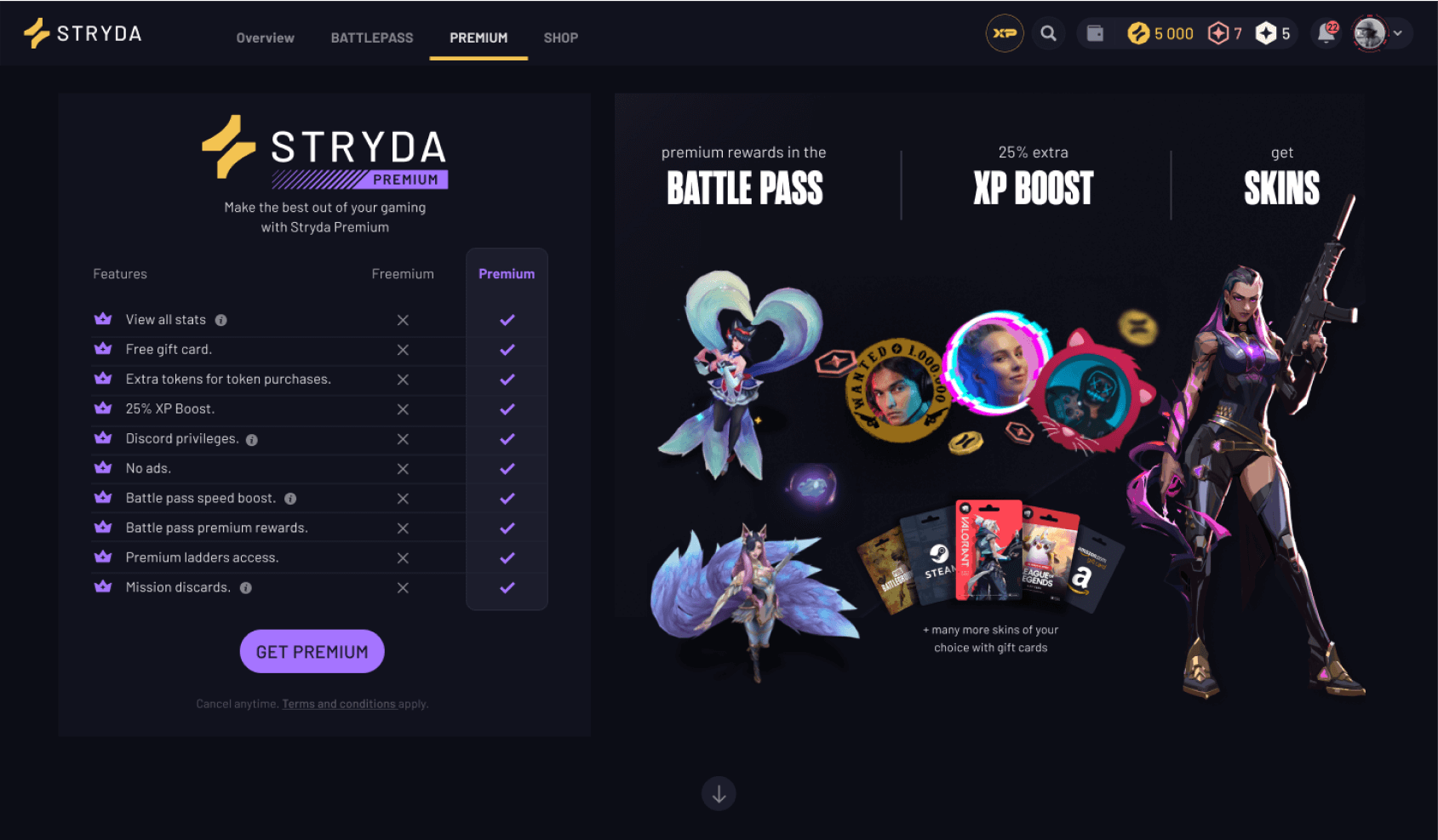
- All offerings are conveniently listed on the top left side of the Premium page, eliminating the need for users to scroll back and forth (fig2).
- Everything is now easily accessible in one place, reducing user effort in finding benefits.
- A comparison between Premium and Freemium benefits has been added for clarity.
- Tagline’s size and copy were updated for improved readability and effectiveness.
- Graphics distractions were minimized, allowing users to focus on features and benefits presented as a list.
- Some features now include an information icon, enabling users to hover and get more details without extensive scrolling.
- The primary call to action, "GET PREMIUM," is prominently displayed after users view the offer at the top of the page.
Improvements:
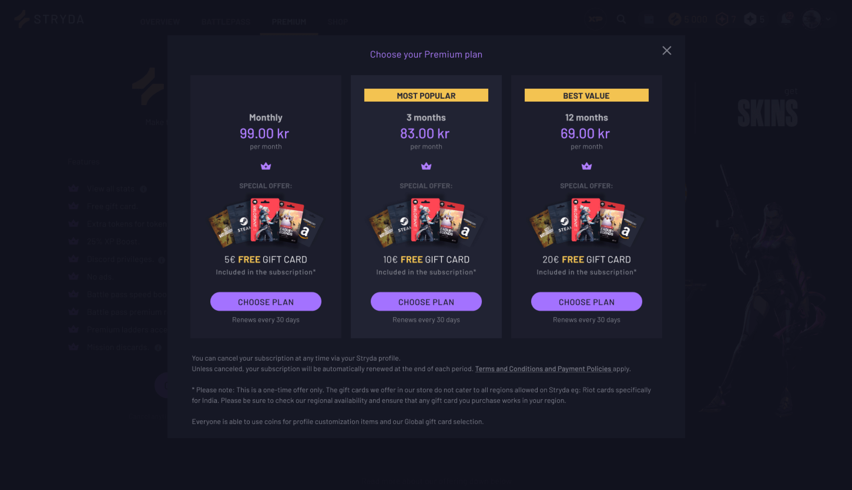
- The visual hierarchy of the plan cards has been updated.
- The most emphasized information is now the price that users will pay.
- Previously, we offered a free $5 to $20 gift card for Amazon, which was highlighted with a different type color and size. However, this information sometimes clashed with the subscription price, leading to confusion. To address this, I reduced the prominence of the gift card details but still used color to draw attention to the "free" aspect of the deal.
- I also updated the design of the gift cards.
Improvements:
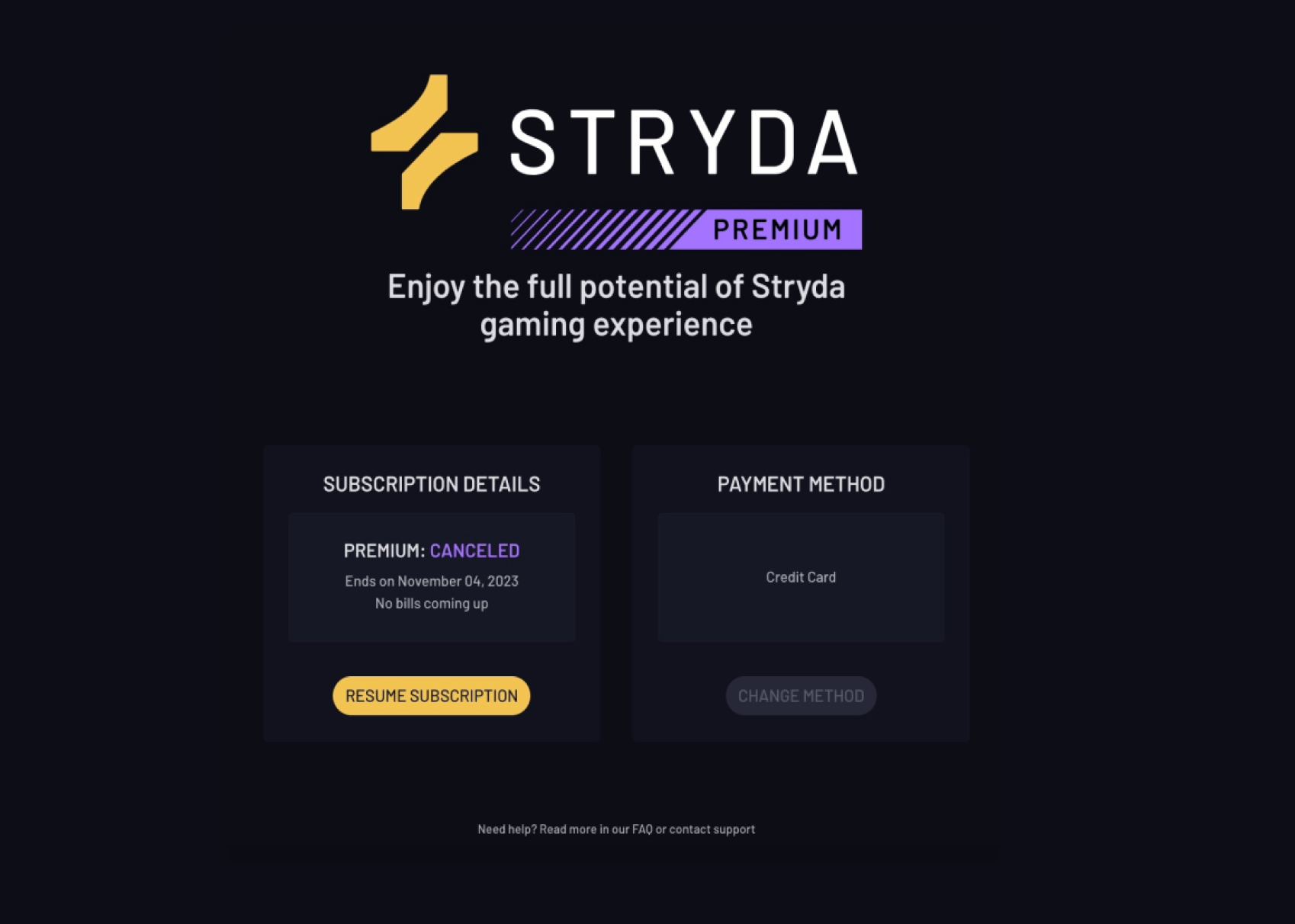
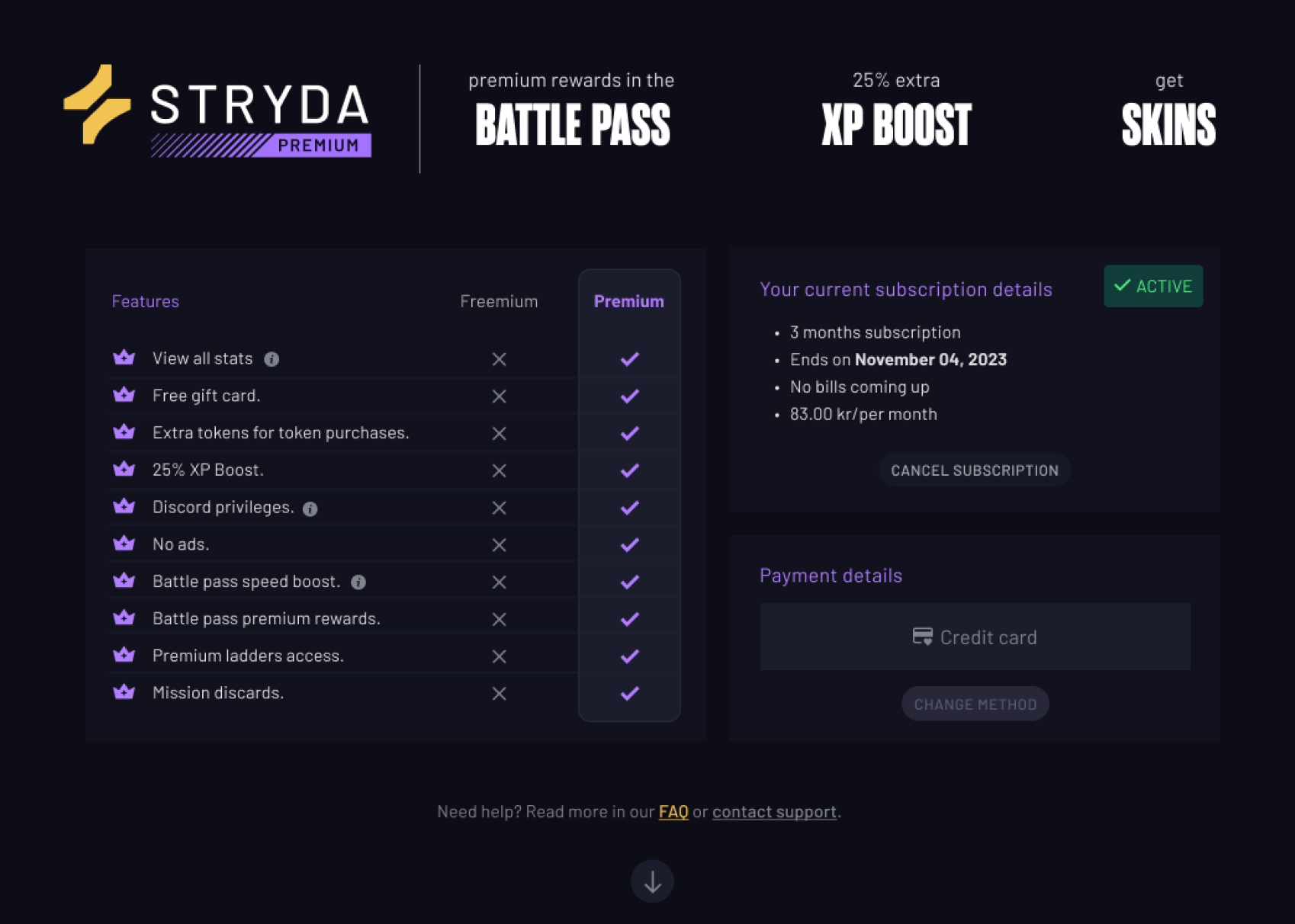
- To ensure users are aware of their subscription details, we have listed all the benefits included with Premium and provided information on what they would have access to if they switch back to Freemium.
- We have enhanced clarity regarding the current plan's status, including adding an "ACTIVE" green tag on the plan.
- Additionally, we have provided clearer information on the subscription expiration date, the type of plan (e.g., duration of subscription), and the monthly payment amount.
- As a sneak peek into future updates, we have streamlined the platform's navigation flow, moving this aspect of Premium subscription management to the settings/account area. However, this a story for another time.
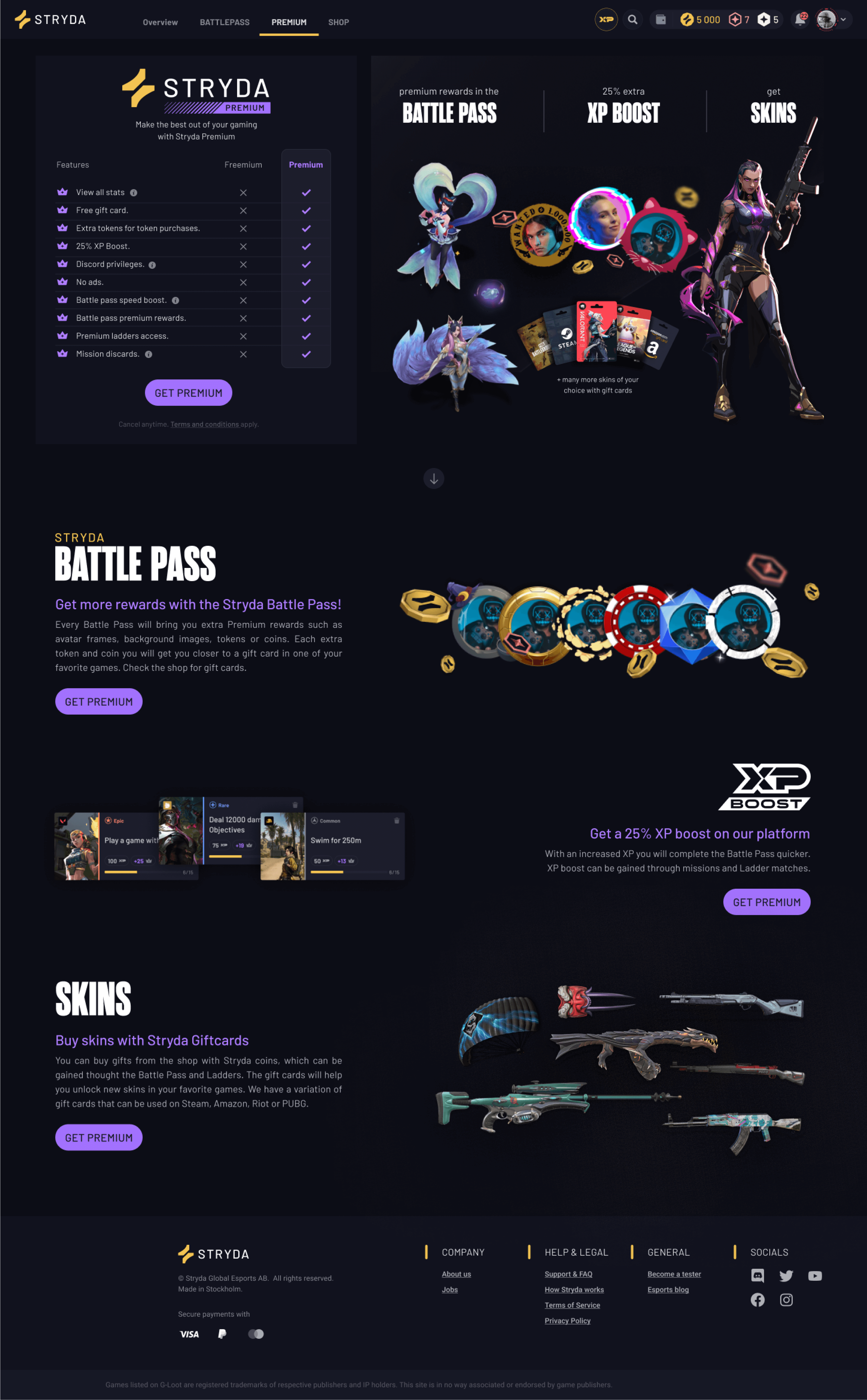
The improvements didn't stop here. Our colleague, Ida Mannerstål, conducted a survey on hotjar.com to gauge our users' sentiments regarding the Premium offering. Over 2,000 people participated in the survey over a few weeks. After its conclusion, we gathered as a team, and Ida shared her findings with us. From the survey results, we identified three major benefits that users particularly liked. We decided to highlight these benefits as the key selling points of Premium, alongside other benefits we offer.
As a result, new content was added on the right side of the screen, next to the list of offerings. We wanted to provide more details about these three selling points of Premium, so we included additional information about each feature, accessible after scrolling.
The entire Figma Prototype happy flow can be viewed in the video at the top. I iterated on this design four times, conducting research on best practices and common patterns for service subscriptions. I had numerous syncs with the team until arriving at this final design.